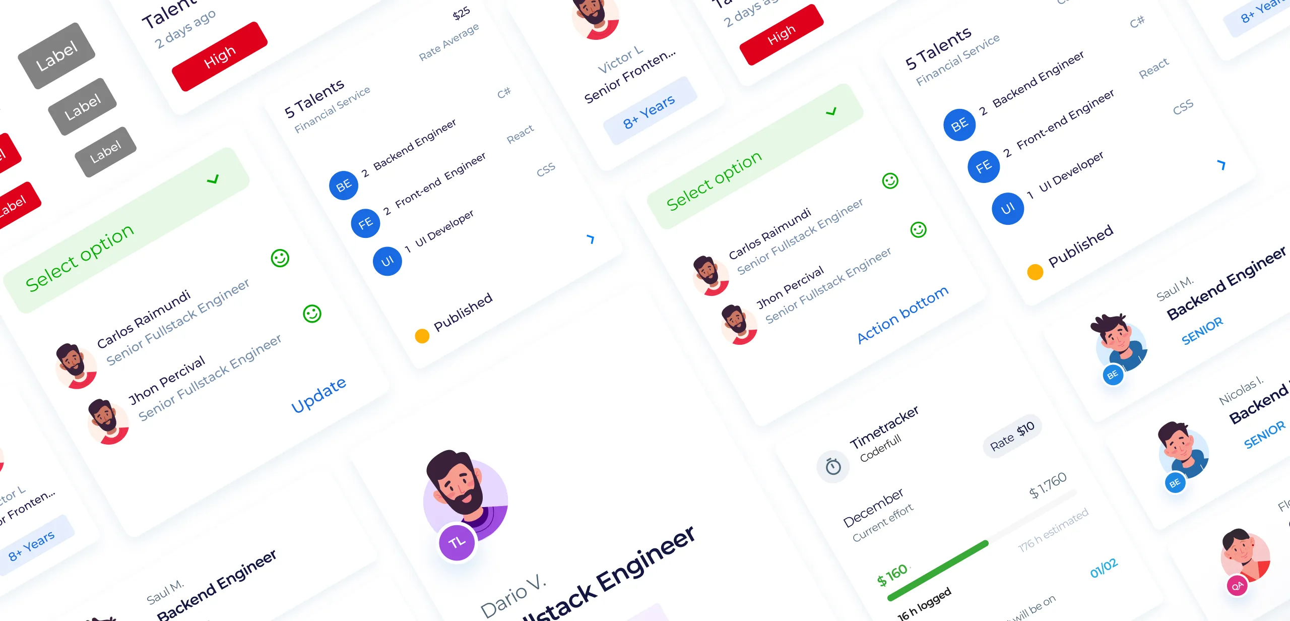

Before creating the Coderfull Design System, our digital products often looked inconsistent. Colors, buttons, and text styles changed from one page to another, making the user experience feel disconnected. Designers and developers spent extra time redoing the same work because there weren’t clear standards or reusable components. This slowed down our process and made it hard to keep a polished, unified look across all platforms.
Develop a scalable design system to align design and development teams, optimizing the creation of consistent digital experiences.
Creating the Coderfull Design System involved a structured, step-by-step approach to ensure a seamless and scalable outcome. We started by identifying pain points through research and audits, followed by defining clear goals for consistency and efficiency. Next, we designed foundational elements like tokens, grids, and components, ensuring they were versatile and reusable. Collaboration was key, as we worked closely with developers to implement and test the system. Finally, we documented everything thoroughly, making it easy for teams to adopt and maintain the system as it evolves.

Our analysis underscores the pivotal role that tables and tabs serve within the application, offering organized data display and fluid navigation. It is imperative to optimize their integration, aiming to boost both user experience and data handling efficiency. Furthermore, harmonizing these components within the Design System is crucial to achieve uniformity, elevate user interaction, and facilitate smoother development processes.

Set Guidelines for the use and combination of Tables and Tabs

Define and unify several components that do not maintain consistency, as well as the styles foundation that are different on each section.

Create layouts congruent with the customization possibilities for certain features but keeping a clear and consistent approach.

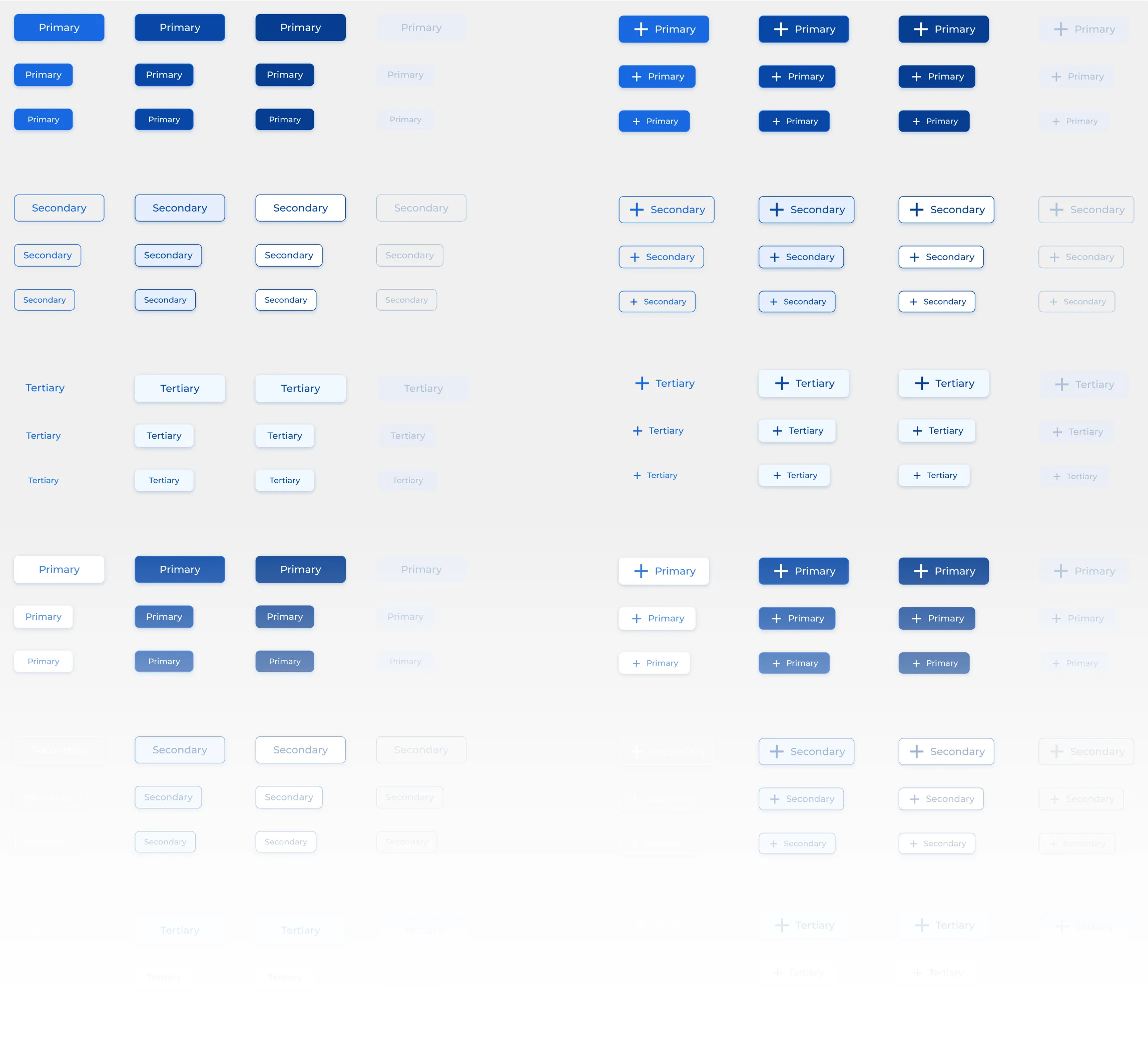
Set the functionality of the chips that work as labels, status and button.

Document topbar main and container. Unify sizes, titles, caption, etc.

Review with the Development team some items to define the guidelines.
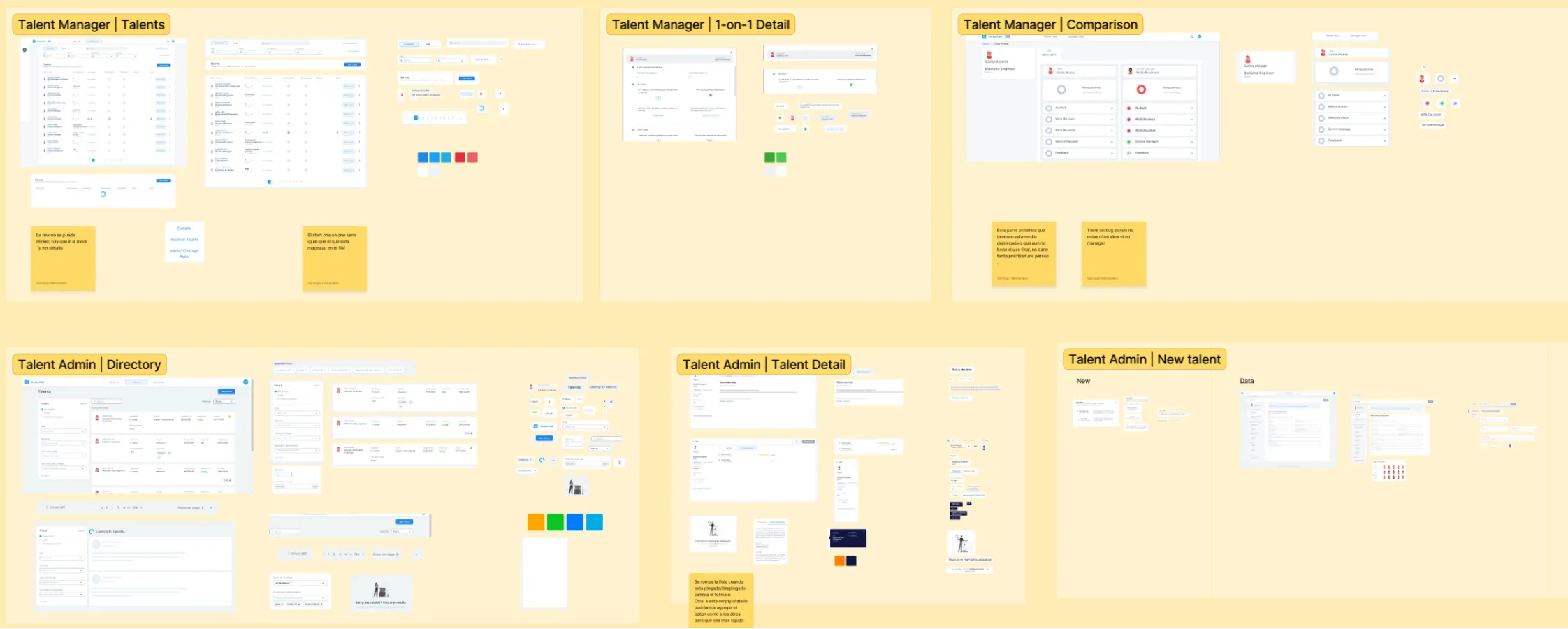
Initiating the Audit process, comprehensive screenshots of each element within Coderfull were meticulously captured. Initially, the inventory was segmented primarily for user interaction, with certain groups of elements structured according to the principles of Atomic Design.
We collected feedback from designers and developers:
We analyzed over 15 internal and external interfaces, identifying variations in typography, buttons, and colors.
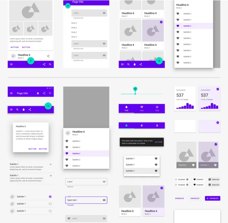
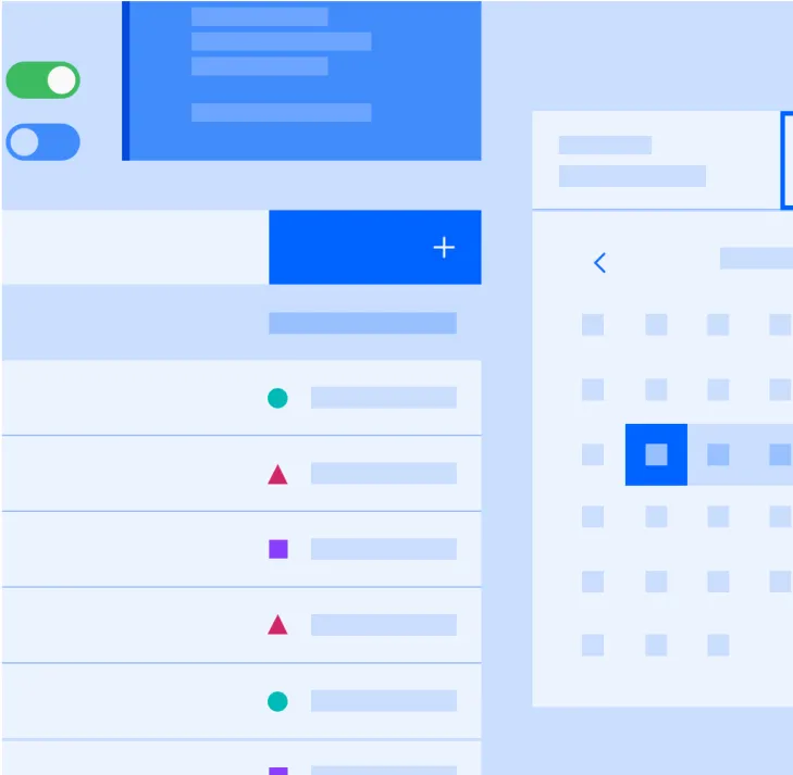
We conducted a benchmark by researching and analyzing design systems like Material Design, Carbon Design, and Spectrum Design. Our goal was to learn from their best practices and patterns.
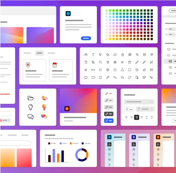
Upon completing the inventory, every element was carefully identified and labeled. Subsequently, all elements were categorized into three distinct groups based on insights from other design system references. This classification set the stage for an in-depth analysis, where components, patterns, and styles underwent a thorough review.
Laying the foundation for a scalable Design System
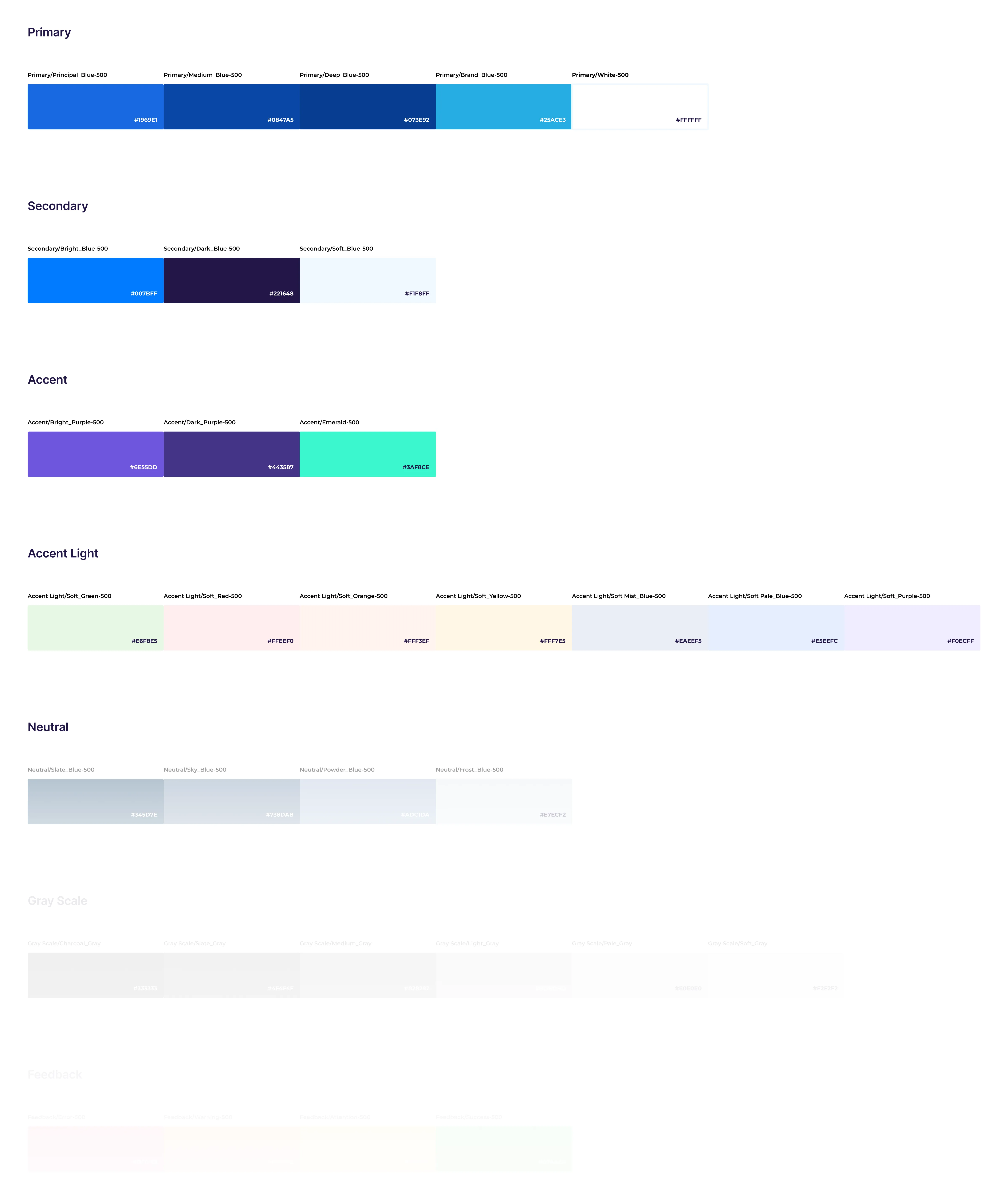
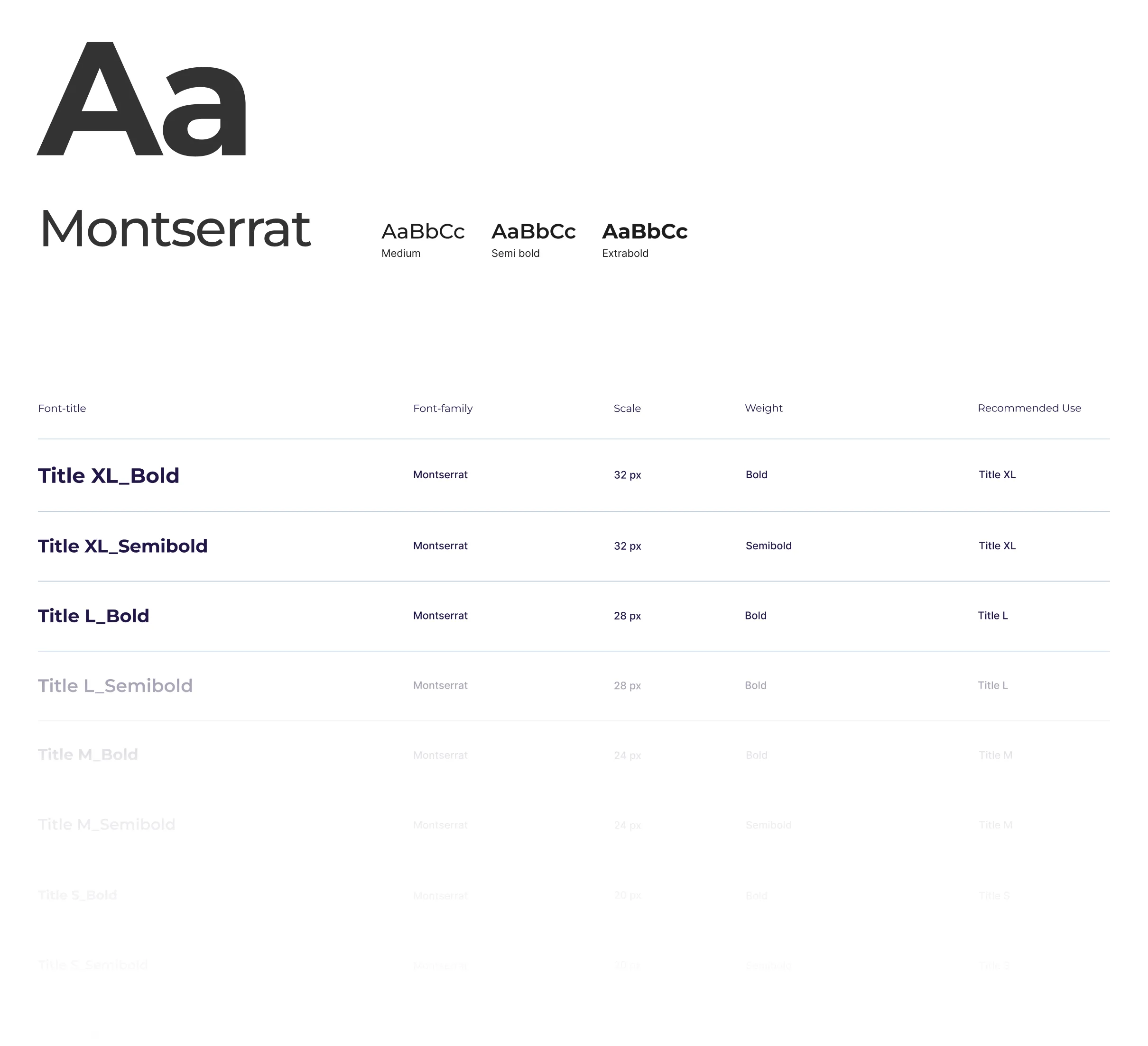
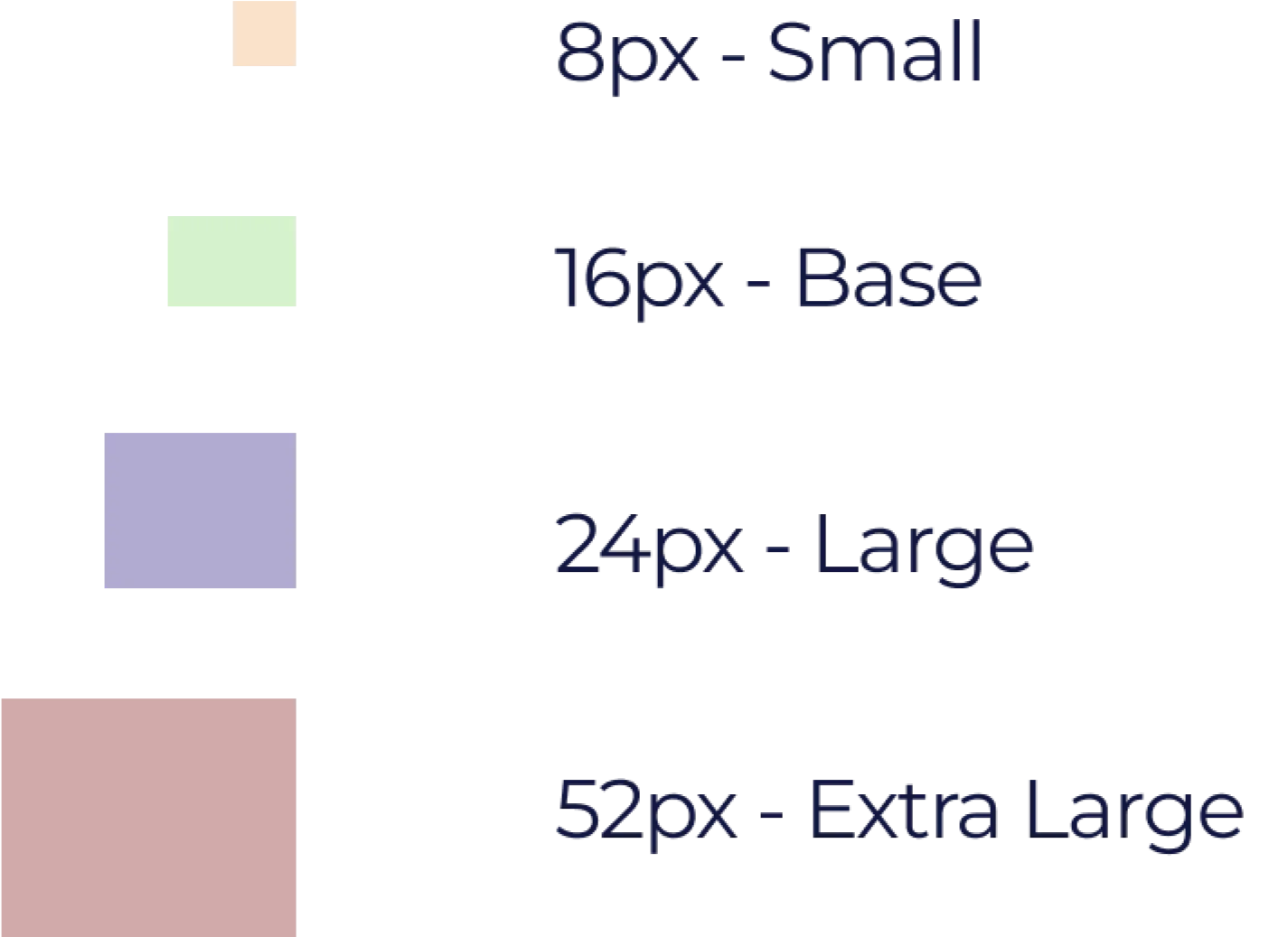
Based on a 8px scale for consistency.
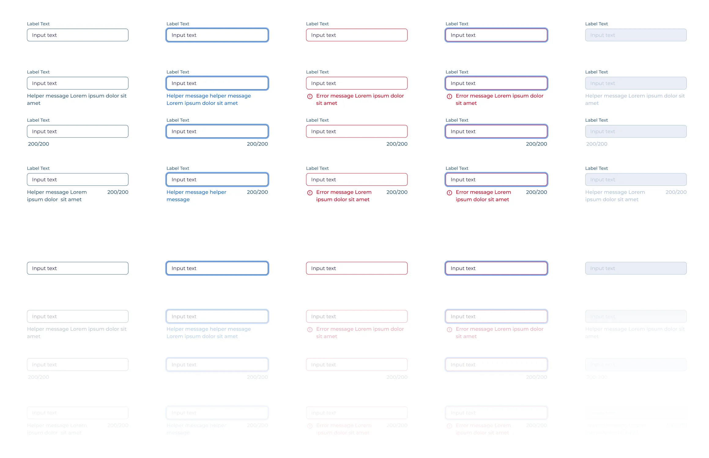
Building blocks for consistent and reusable interfaces
Tools Used

Figma for component design

Storybook for dynamic previews of React components.

Confluence for accessible documentation across teams.
Measuring success through impact and efficiency
The overall time required for the design process has been reduced by 30%, resulting in increased efficiency and faster project completion.
Component reuse has increased by 70%, leading to greater efficiency and consistency across the design system.